
🏥 Truffle Health
Project
Design ChallengeTeam Members
N/ATimeline
1 WeekOverview
As part of a design challenge from Truffle Health, I designed a mobile interface to help users through the process of understanding and paying complex medical bills.
Problem
Navigating the intricacies of medical billing, from interpreting complex insurance documents to resolving disputes over puzzling charges, can prove to be a daunting and overwhelming task for patients already under stress.
Patients often experience uncertainty and frustration while waiting for their bills to be processed, which can take several months. When bills do eventually arrive, the situation may only intensify as patients may struggle to remember the specific services they were charged for.
The payment process for medical bills should not compound problems for patients who are already grappling with other challenges.
Solution
I developed a user flow based on 3 main features that would alleviate prior pain points and implement functionality that would assist them to have a better payment experience.
Upload with ease
Users can upload a photo of their medical bill to pay online and receive a breakdown of charges.Simplify complex bills
Confusing charges & insurance details are broken down into understandable items.Multiple ways to pay
Give users more control and ease over how they pay their medical bills online.Research
Competitive Analysis
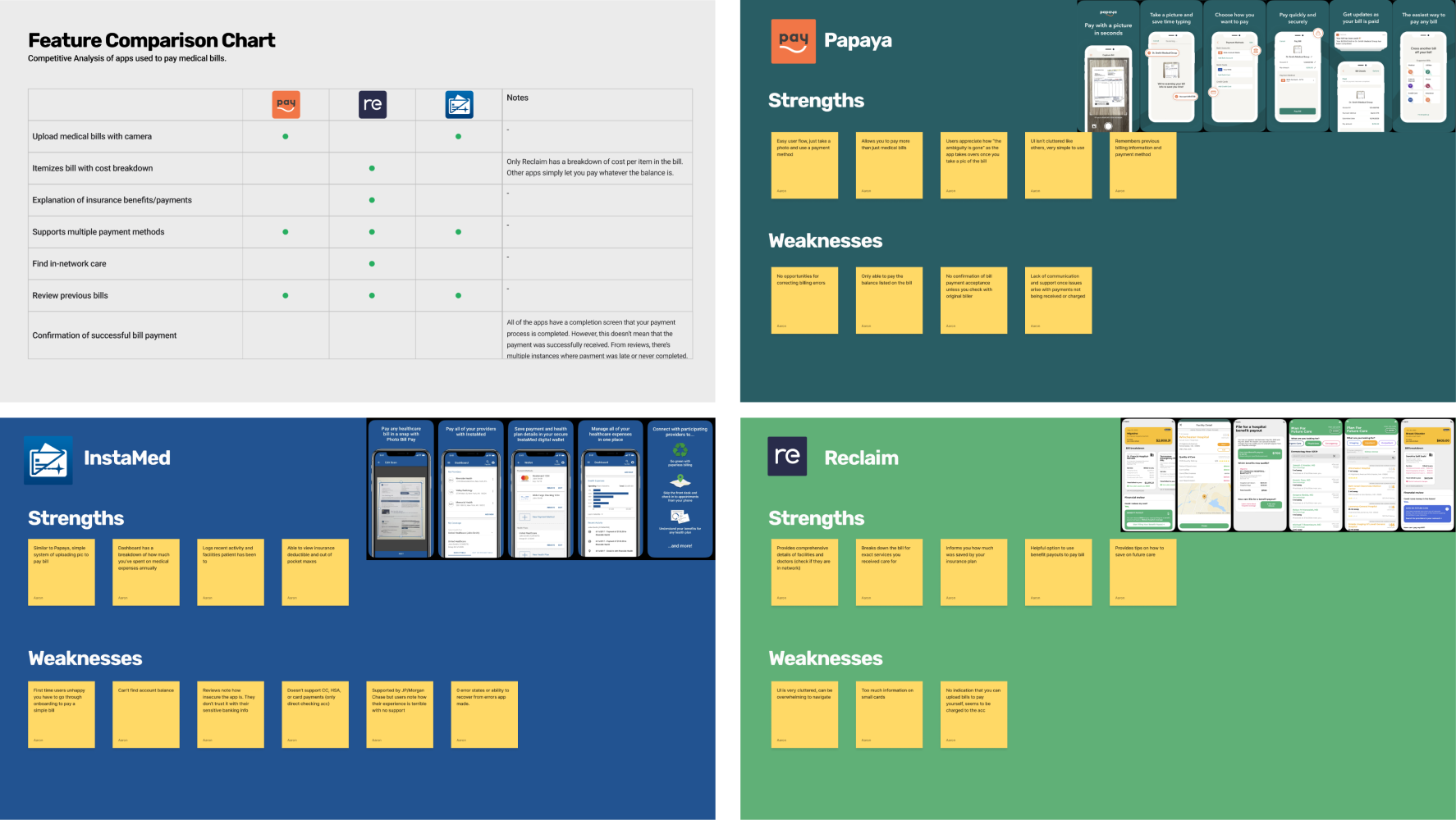
I evaluated existing medical bill payment applications to gain a better understanding of the market and to discover potential areas for improvement. The three apps compared were Papaya, InstaMed, & Reclaim.
In my analysis, I scrutinized various aspects of each application using Neilsen's heuristic principles to guide me. By delving into the strengths and weaknesses of these platforms, I was able to identify common pain points and opportunities to improve within the medical bill payment sector.
Interviews
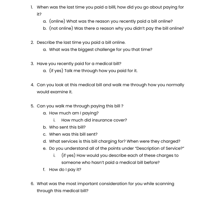
To gain a better understanding of how comprehensible medical bills are, to the average person, I interviewed some peers. These interviews were structured around asking participants to recall past experiences with paying bills and their perceptions of medical billing processes.
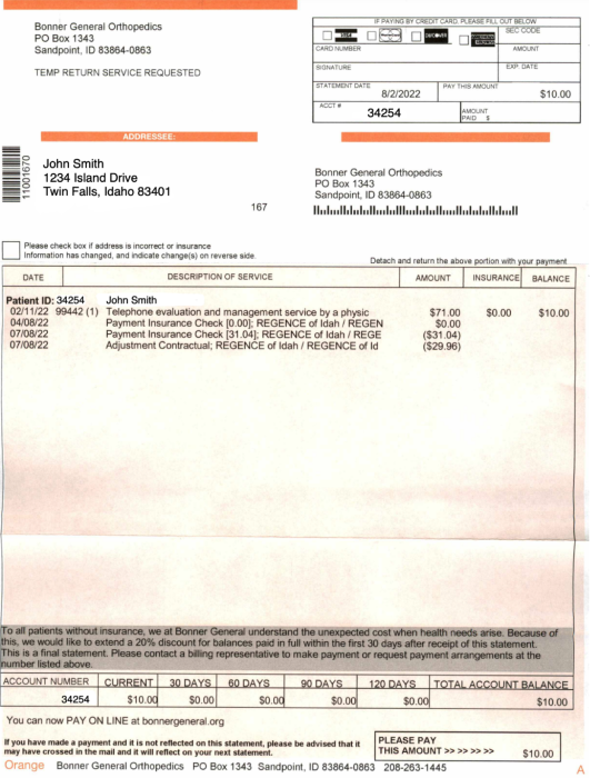
Additionally, I requested them to walk me through a provided example medical bill to gauge the clarity and understandability of current billing formats.
Personas
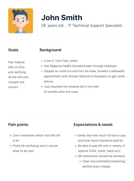
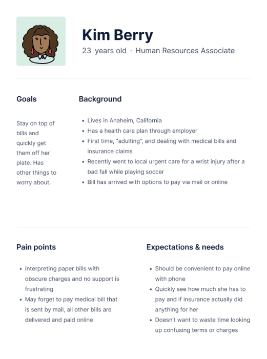
Personas were crafted based on insights from the interviews which offered a deeper understanding into users' specific pain points with medical bills and helped identify potential solutions to alleviate them.
Synthesizing my interview findings and personas, a clear pattern emerged: users wanted a seamless and convenient online billing experience that is transparent and clear enough for them to easily understand what exactly they are paying for.
Ideation
Sketches
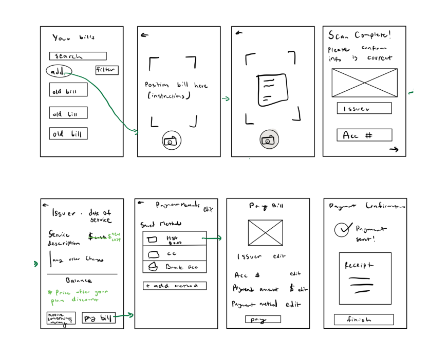
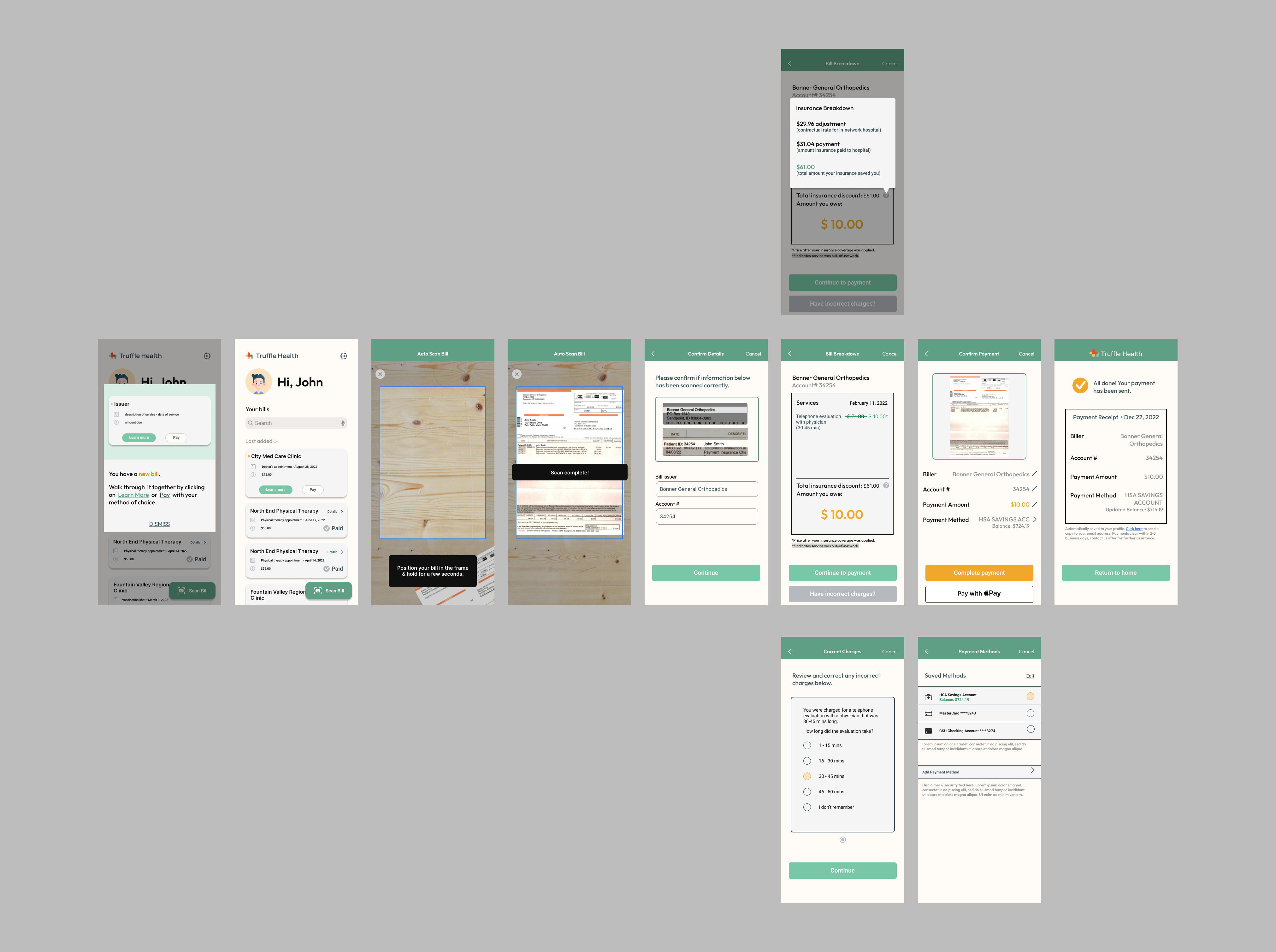
In this flow, a user adds a new bill by scanning it with their phone. They'll confirm that the scanned info is correct before proceeding to a bill breakdown and payment screens. At the end of the process, they will receive a receipt.
Wireframes
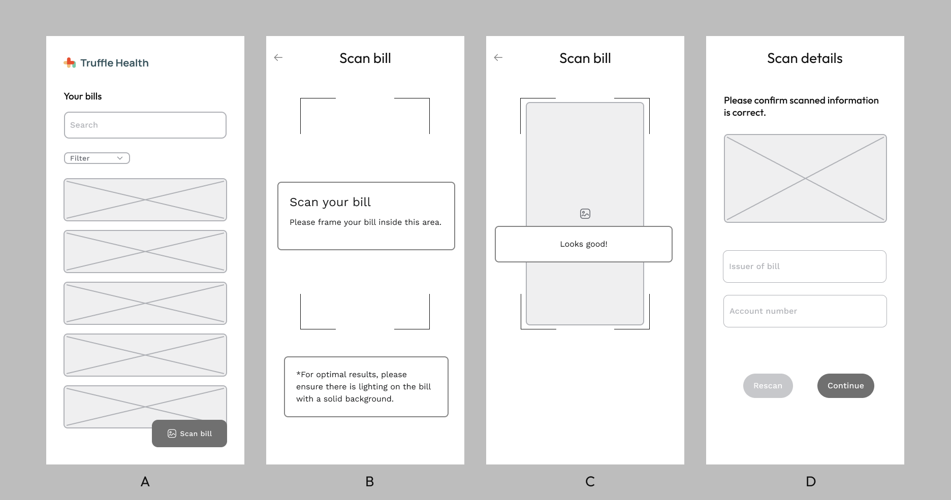
In this iteration of the home screen (Figure 1A), bills are displayed as cards with the ability for users to search or filter them. There is a floating button located on the bottom right of the screen that allows users to scan a bill that wasn't automatically uploaded to their account.
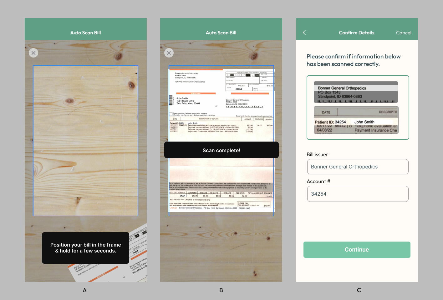
Users are guided to scan their bill by positioning it inside the frame (Figure 1B/C). In this scenario, the user isn't required to take a photo but instead, keep the bill in the frame for a few seconds.
Afterward, they are prompted to confirm or correct auto-filled scan details (Figure 1D) concerning who issued the bill and the patient's account number. Snippets of the bill are positioned above to display what was scanned and provide users with easy recall for confirming crucial information.
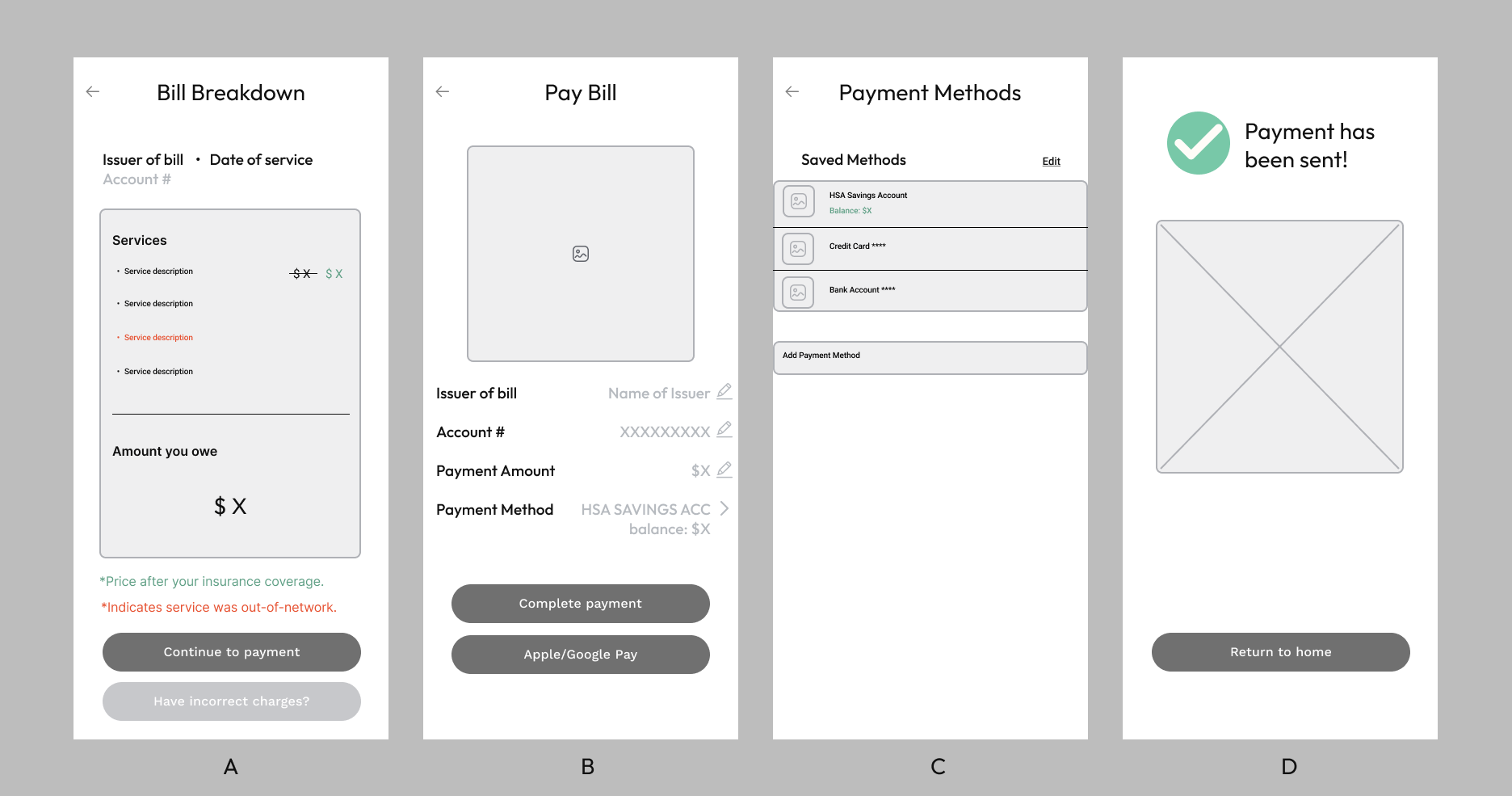
Once the bill issuer and patient account number are validated, the bill is broken down (Figure 2A) into a simplified version that displays the amount the patient needs to pay.
When the user goes to pay the bill (Figure 2B), they can edit the bill issuer, account number, amount to pay, and payment method. If they choose to alter their payment method (Figure 2C), they can select from a variety of options such as credit card, bank account, and HSA account.
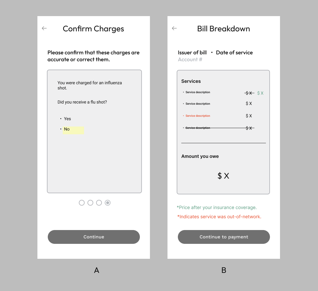
Supported with an understandable version of their bill (Figure 3A), users must have the ability to resolve any charges they believe are incorrect. Before continuing to pay, they can go through a questionnaire that helps resolve errors in service charges (Figure 3B).
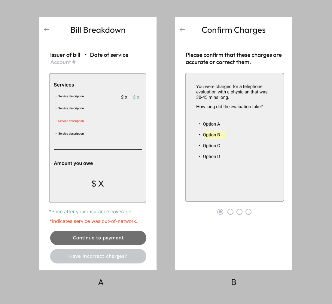
Upon completion of the questionnaire (Figure 4A), their bill will be updated to reflect any errors discovered. (Figure 4B).
Prototype
When users receive a new bill for the first time, they will be greeted with a pop-up (Figure 5A) that demonstrates an example new bill (Figure 5B) indicated by an orange dot and explains how they can simply pay it or have a guided walkthrough.
The search bar and sort feature increase accessibility for users should they become inundated with too many bills. On the top right, a gear icon provides access to important settings such as payment methods, account settings, etc.
The floating “Scan Bill” button is positioned on the bottom right of the screen. Beyond affording one-handed operation, since most of the cards' text is located left and center, its position doesn't block essential information. Users can still easily distinguish paid/unpaid bills by the presence of the two action buttons even if “Scan Bill” may block the “Paid” indicator for paid bill cards.
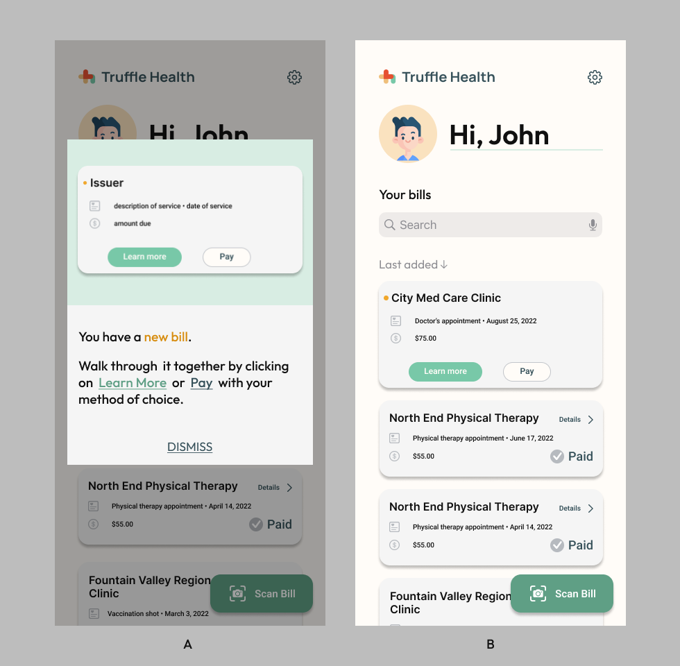
Comparing the cards from Figure 5B to Truffle Health's original design (Example 1), the position of the “Learn more” and “Pay” buttons have been shifted to below the card text rather than right-aligned (Example 1). The purpose of this small change was to prevent clutter, especially with longer institution names, and afford greater button tolerances to crucial features.

Scanning process instructions were also simplified and the frame has been made clearer as well. It's no longer defined by small corner marks (Figure 1B), but instead by a full bounding box (Figure 6A/B).
The billing details must be correct. Scanning won't always be 100% accurate, so user input may be necessary. In this instance (Figure 6C), the auto-filled scan details are correct. If they weren't, the user can correct it themselves.
Users wouldn't want to do extra work if they're already scanning a bill. If they have to do extra work, it is essential to at least make it easier for them to do so. The scan snippets accommodate by providing support for a user to use them to quickly confirm or correct the information.
For this prototype, we are scanning the bill (Example 2) provided by Truffle Health. There is only one charge, a telephone evaluation, with the other points being insurance-related payments.
This was a point many of my interviewees noted as confusing since the amount for insurance discounts was placed in the same column as the evaluation charge (without a clear indicator like a minus symbol). It didn't help either that the description for the insurance discounts was overly long and confusing.
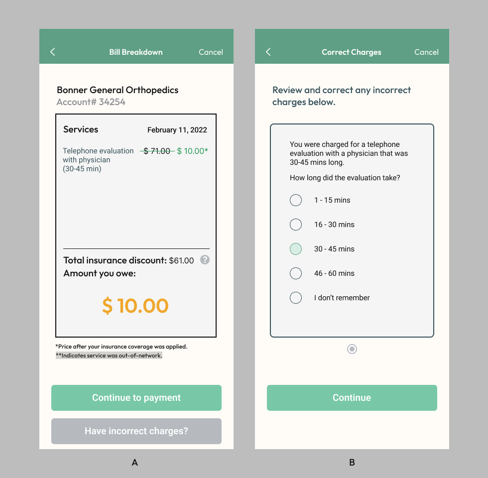
This problem is solved with a simplified bill (Figure 7A) that lists only the charge and its discounted price. A strikethrough signifies the discount in effect accompanied by a new, color-coded price. The information below explains the meaning of the discount and how an out-of-network charge would be highlighted.
Figure 7B is the questionnaire users can use to correct or catch errors in service charges. It is accessed through the “Have incorrect charges?” button. If I had more time, I would've liked to A/B test with users and see if they prefer having the process take place before their bill breakdown instead, as an extension of the scan details confirmation.

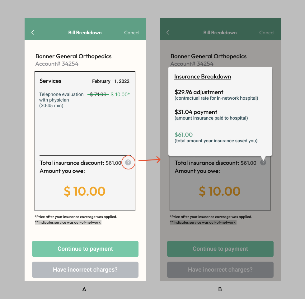
With the simplified bill (Figure 8A), the discounted charge price and final amount owed are prominently displayed. However, if users would like to see in-depth details about how their insurance covered them, they can access a breakdown (Figure 8B), through the question mark next to “Total insurance discount”.
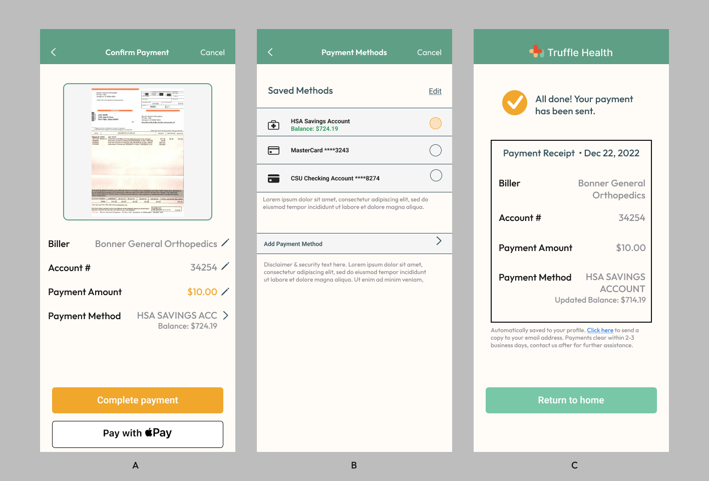
On the payment screen (Figure 9A), users can make any final edits and use the scanned bill to confirm all the details are correct.
Multiple payment methods are available with a clear indicator of which one is being used (Figure 9B). Since users can pay bills with an app, they should also be able to conveniently pay with Apple/Google Pay which is integrated with their phones.
Once users finish the payment process, they'll be presented with a receipt. The receipt (Figure 9C) is automatically saved in the app for the user with an option to send a copy via email.
Reflection & Next Steps
To determine what users would prefer, I would like to A/B test two different flows: the one in this case study and one where users go through the charges questionnaire before bill breakdown, immediately after confirming scan details. I'll measure success by whichever has a higher payment success conversion rate and user satisfaction.
”I just want to know how much to pay and that my insurance did something.”I designed it to be minimal and clear to reflect my interviewees' thoughts from their bill walkthrough while maintaining the option for curious users to explore and learn more.