🌎 Eco-tracker
Project Details
COGS 120 projectTeam Members
Megan Dinh, Brendan Jew, Tatum MasonTimeline
9 weeks (Winter 2020)Overview
Eco-Tracker is an application that allows users to easily track and visualize daily habits to become more eco-friendly.
Developed as part of COGS120 project to design & code an app that uses data to motivate users in achieving a goal.
Problem
Maintaining the motivation to be eco-friendly can be hard
Through several interviews & surveys with students on campus, our group identified that the majority of young adults want to be more environmentally conscious. However, we identified three recurring issues that negatively affected their motivation.
...and current solutions aren't making it easier.
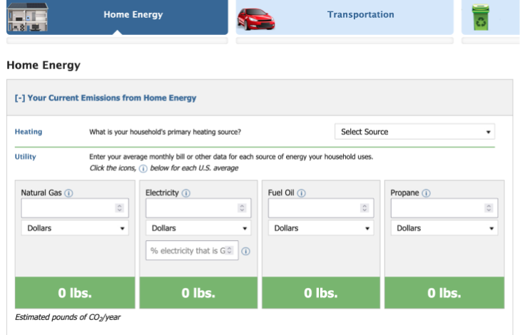
Auditing existing emissions trackers, our team discovered that many were simply estimators that weren't efficient for daily use and did little to motivate an eco-conscious lifestyle.
Most only provided users with rough annual estimates of their total carbon emissions, which is too arbitrary for most users to conceptualize their impact.
Solution
💡 Users need a tangible, adaptive tracker that keeps up with their ever-changing daily lives!
From our interview findings and audit of existing trackers, we recognized that current solutions weren't working because their results were difficult to fully conceptualize and easily track activities that varied day-to-day.
Maintaining motivation while seeing no tangible results is difficult for any goal, but even more so if you don't have an effective way to measure your progress.
Design
Storyboard
To get a better understanding of how Eco-tracker could solve these problems, our team storyboarded daily scenarios where our app can provide users ease in dynamic tracking in an everyday scenario.
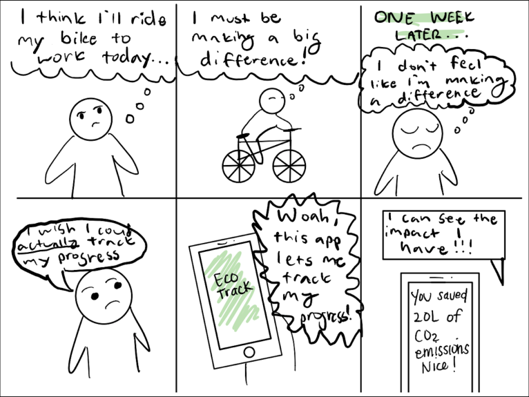
Creating storyboards helped our team synthesize our previous research and findings to envision scenarios of Eco-tracker's dynamic use & how it would address the opportunities from our need finding.
Wireframes & Paper Prototypes
With an understanding of Eco-tracker's design opportunities, our group tested with two paper prototypes that focused on different main functionalities.
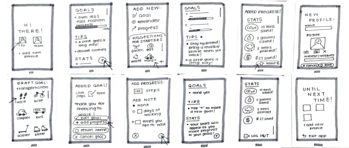
For prototype 1, the main functionality is for the users to add goals and reminders that will help them be more eco-friendly.
In this prototype flow, users join and can scroll through one screen to see their progress on goals, personalized tips, and stats based on their goals.
The highlight of this design is its all-inclusive home page, which houses all pages and promotes the addition of goals/tracking of progress with an “add” button cemented in the bottom corner of the screen.
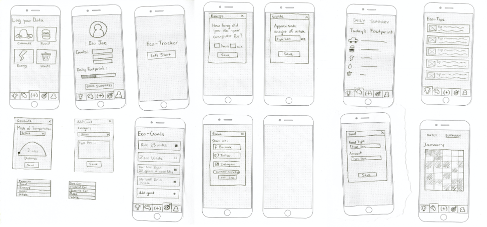
For this second prototype, the emphasis is focused more on tracking in general with the optional use of setting goals. As such, compared to the other design, this flow is anchored by visualizations of their day or month eco-footprint.
The primary goal for this prototype was to facilitate quick tracking and understanding of user environmental impact tangibly.
Users can navigate between different pages with the bottom menu bar to log data, view summaries of their data, discover tips to reduce their carbon footprint, create goals, and create a shareable profile.
Figma Prototype
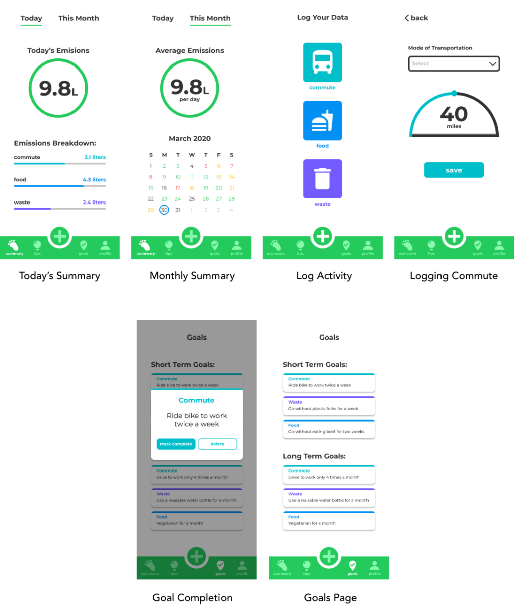
Prototype 2 was chosen to be further developed into a mid-fidelity wireframe as its statistics-focused home page would best support users in developing eco-friendly habits and address the opportunities discovered from our need finding.
The main functionality of this prototype is data logging and viewing summaries of users' daily or monthly emissions to evaluate if they are making a difference. It visualizes the impact that users have so that they can easily recognize trends to make impactful changes.
Testing with Users
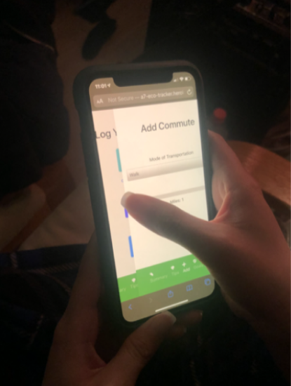
Tests were conducted using mobile phone browsers to complete tasks with our coded prototype.
For our initial round of testing, four random users from our main demographic (young, eco-conscious adults) participated. They were given a list of tasks to accomplish, as we observed for any potential pain points or issues. Afterward, they were asked a few questions regarding their overall sentiment of the app, any frustrations/confusing areas, and whether it was effective for them at all.
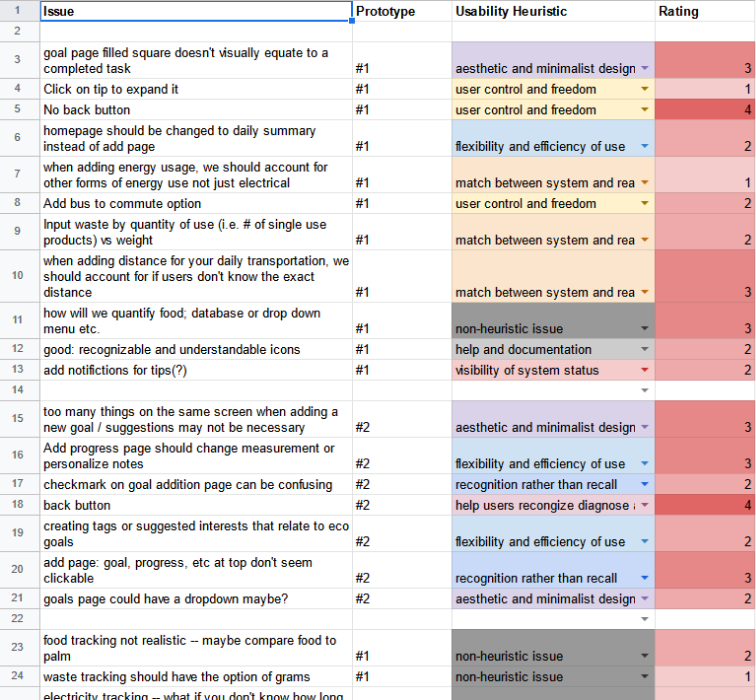
The results from testing were far from perfect with three general pain points that our testers all experienced.
- There is very little information on the summary page, or even the app in general, about what each element means.
- Users' mental models clashed with the conceptual model, so they did not know what to do with the information presented to them.
- There isn't a lot of context on this page, so the user is not quite sure how their number compares with others.
- This causes users to feel distant and they don't feel any empathy since the numbers seem arbitrary to them.
- This was seen when the user accidentally clicked on a button and had no way of returning to the previous page.
- Furthermore, the slider on the add commute page does not consider the spatial layout of elements in relation to the user’s gestures. This error is not prevented by the system image, so the user feels frustrated when an error occurs at the fault of the app.
Updating Prototype
To resolve the majority of issues brought up from testing, our group focused the redesign on the home page, logging interactions, and menu bar.
In our final prototype, our team worked to address the issues brought up from our user testing sessions surrounding unclear signifiers, ambiguous data presentation, & buggy interactions.
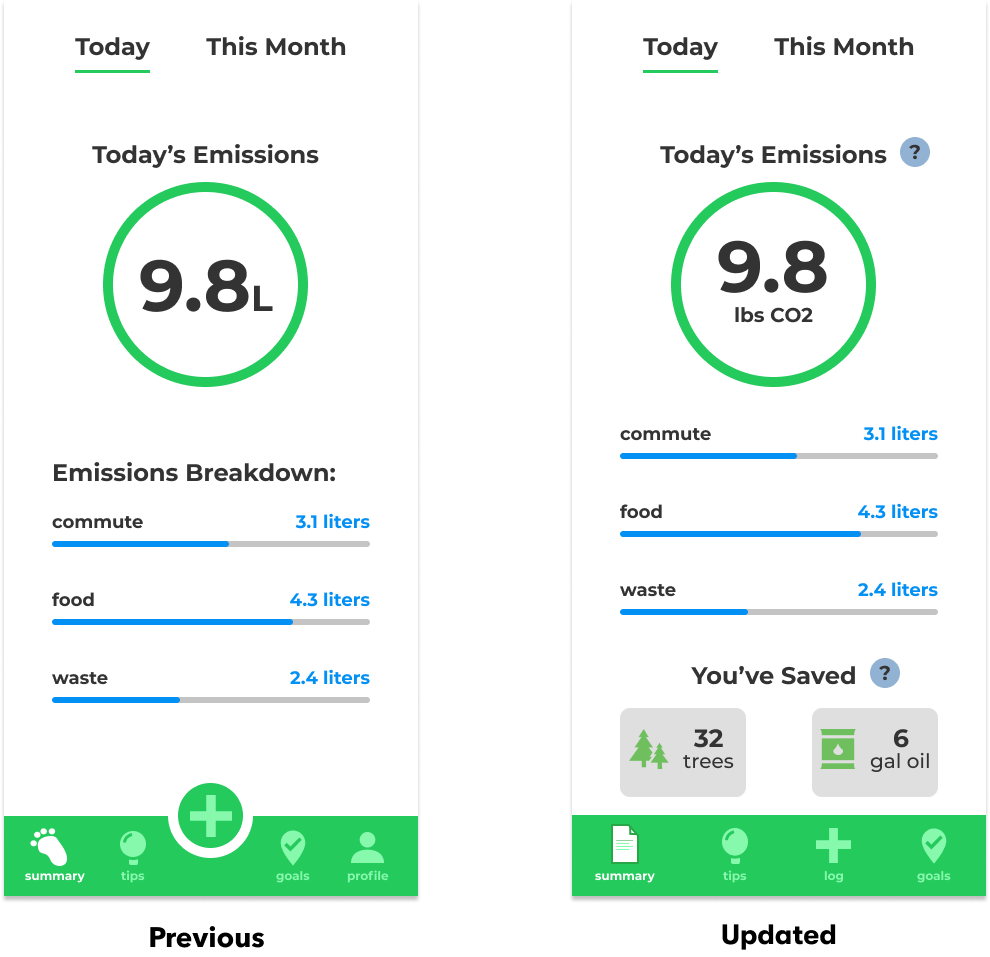
Signifier (navbar) Updates
- The summary icon has been updated to one more representative of its affordances
- Removed unnecessary “Profile” tab from the menu bar as a social network function was out of scope for the project
- The “plus” icon was made larger and centered to increase ease of access to the main functionality of tracking
Clarified Data
- Changed the ambiguous “L” unit to “lbs of CO2”, a more common unit of measurement that users are accustomed to
Increasing Motivation
- Added modules that helped visualize users' impacts in terms of positive environmental impacts such as “trees saved”, shifting tracking focus from carbon wasted to instead positive gains from habit changes.
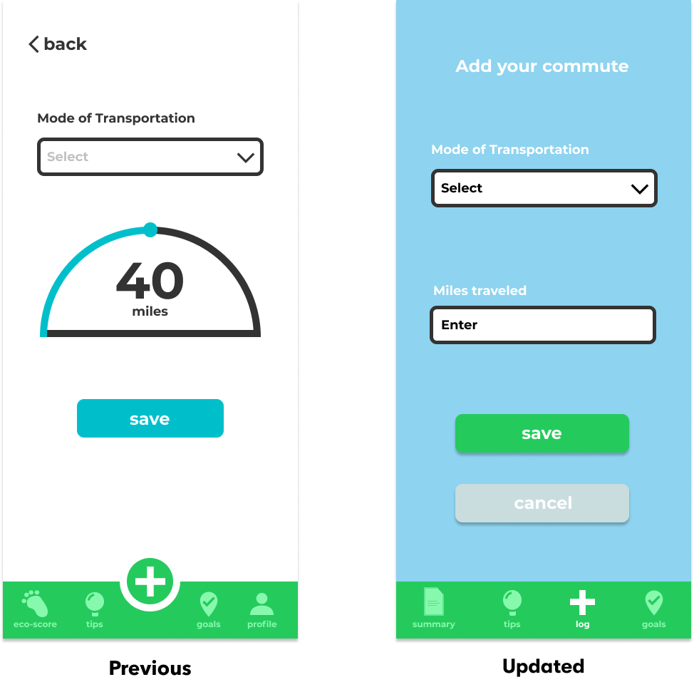
Easier Logging
- Users can input their exact mileage with a pop-up numpad
- Previous slider that didn't offer as much control
- More user freedom is afforded by entering values than by adjusting a scale
Validating Updates
To validate if our new changes were effective, we conducted A/B testing with 152 users.
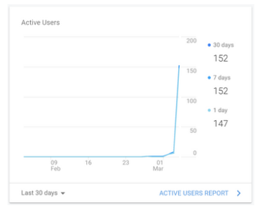
The participants, sourced by a team member who was a DSGN 1 IA, were randomly assigned either the old or updated versions.
To measure the effectiveness of our changes, we tracked how many users were able to successfully log miles traveled & how long it took them to do so using Google Analytics. We measured success through the metrics of successful task completion and how long the task took.
Of 115 successful task completions, the updated version (/viewAlt) had a higher rate of success 20% more than the original (/commute).
Additionally, (/viewAlt) was also quicker on average to complete than (/commute) by 20 seconds!

In summary, the results validated our updates as there was a statistically higher and faster completion rate of the task than the original version. We considered it a success as more efficient tracking would make it less of a chore for users, encouraging them to continue it as a positive habit!

You can find a more in-depth write-up of our testing data, analysis, & data figures here!
Reflection
And that's how we created Eco-tracker! From paper prototypes, wireframes, & Figma mockups, our team produced a coded version of Eco-tracker that you can click through!
Thank you to my team for a great learning experience through designing, testing, and coding Eco-tracker