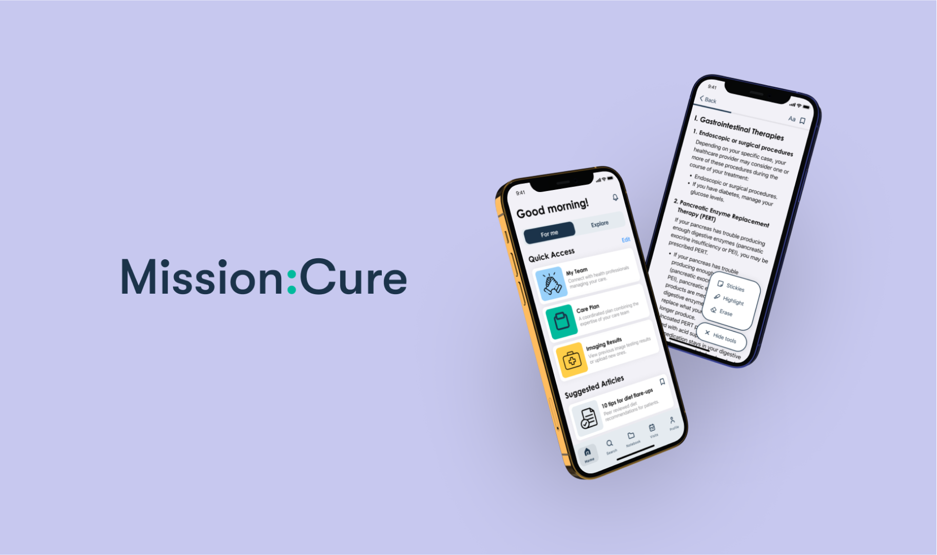
👩⚕️ Mission: Cure
Role
UX/UI DesignerTeam Members
Sarah Fang, Shelley TaoTimeline
July 2021 — December 2022Overview
Developing an interactive experience where patients with pancreatitis could learn more about managing their symptoms, create care plans, & interact with personalized, curated articles.
*This project is still in development. Designs have been altered and aren't representative of the final product. Contact me for further questions about my experience.
Problem
❓ How might we improve upon Mission Cure's desktop site to better support patient engagement?
From Mission: Cure's prior research, they have seen evidence that informed and engaged patients advocate for and subsequently receive better care. However, the current website doesn't have the functionality to support user engagement.
Solution
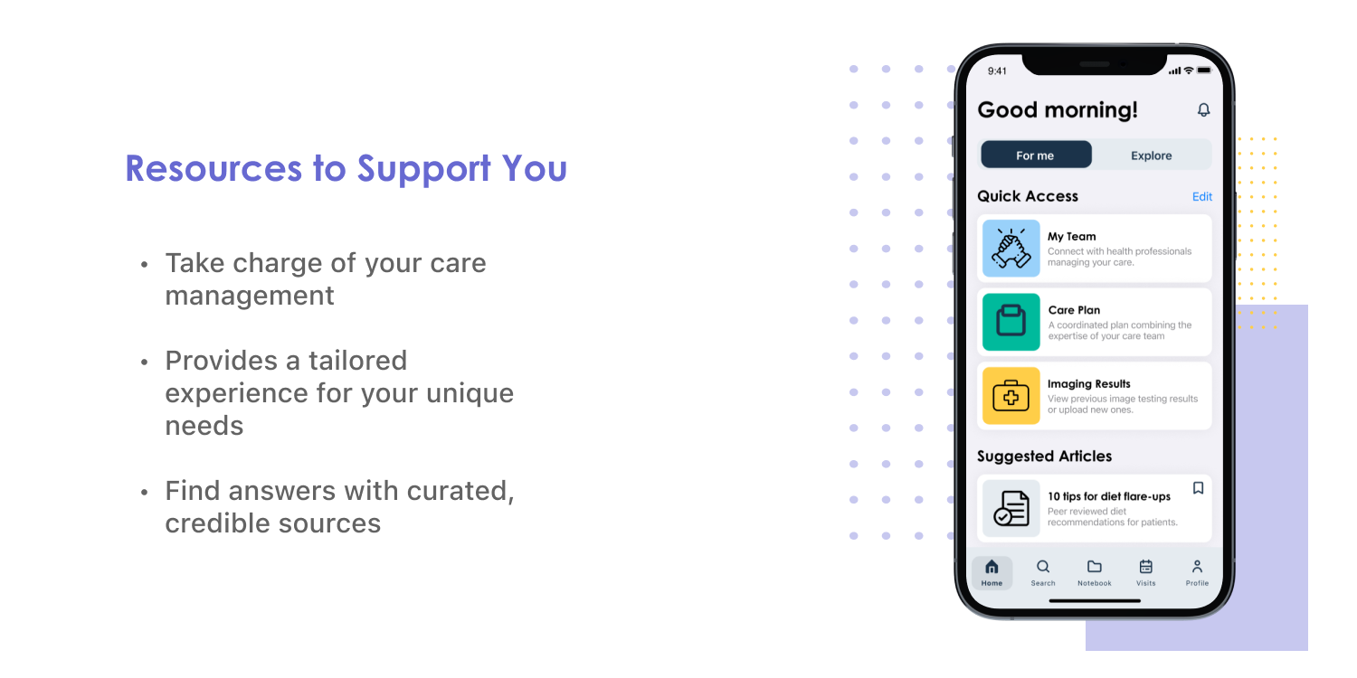
💡 Update the website into a mobile experience that facilitates engagement through interactive features.
My Role
UX Design & Research
With two other designers, I conducted user research, design, and prototyping to develop a new mobile experience for Mission: Cure.
Research artifacts, wireframes, & lo/hi-fidelity prototypes were created, tested, and presented to stakeholders. Throughout the entire process, design updates & hand-offs were shared with the front-end dev team.
Research
Understanding the Current Platform
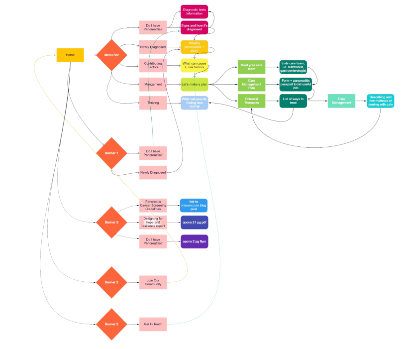
Our team mapped out Mission: Cure's current site and discovered that it was very limited in functionality. It mainly consisted of static pages with text information or PDF files which offered little opportunities for interactive user engagement.
Interviewing Patients
We conducted user interviews with pancreatitis patients and caregivers to get a better understanding of how the new platform could support them.
We had them walk through the previous site and asked them questions to gauge how effective it was as a tool in their pancreatitis management.
Interviewees and prior testimonials, provided by our stakeholders, commonly expressed that many wanted to improve their care by taking a more active role but failed due to a lack of information or being overwhelmed by all the various aspects of their care management.
Competitive Analysis
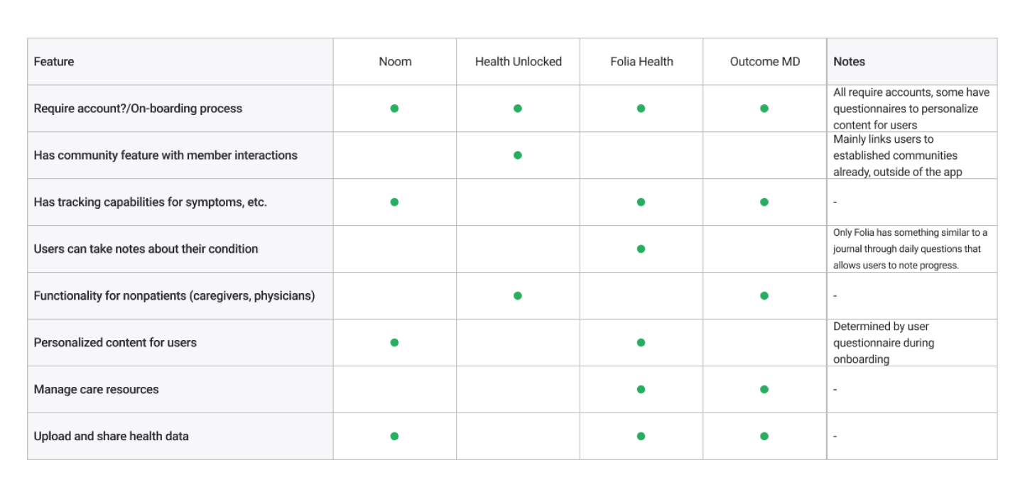
Mission: Cure didn't have a mobile application we could compare with. So, our team conducted a competitive analysis of health apps, chosen explicitly by stakeholders, to identify features and strengths we could build off of.
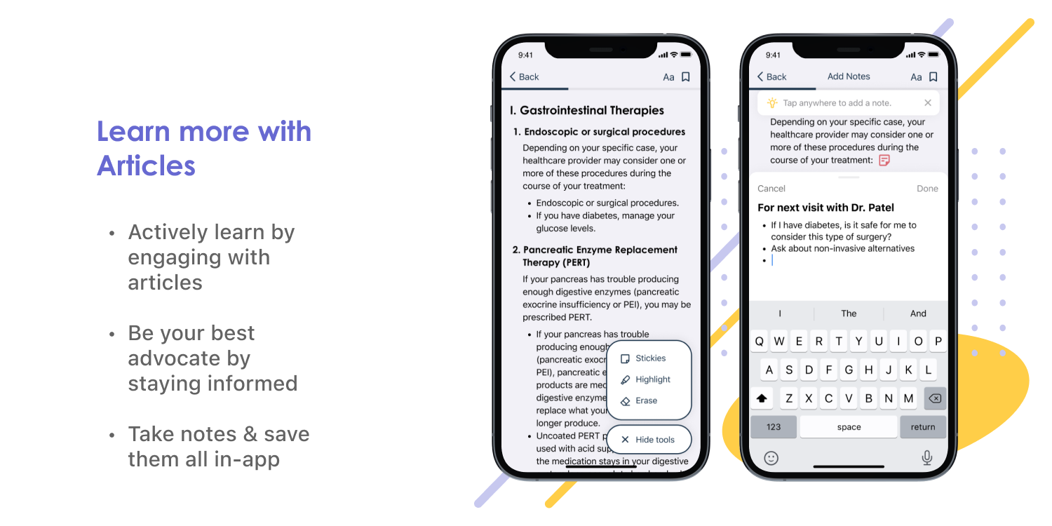
From our analysis, we identified gaps that Mission: Cure could address by prioritizing the ability of users to take notes about their condition and subsequently utilize that information in advocating for better care or sharing it with others in the community for advice.
Synthesize
Personas
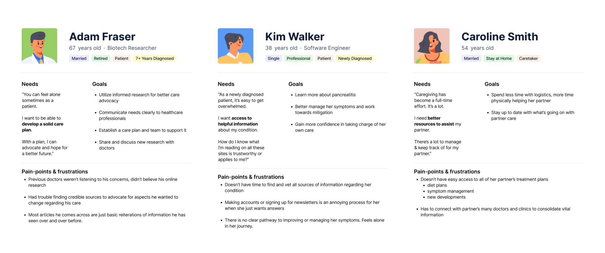
To empathize with our users and understand the problem space from their perspective, personas were constructed from our findings to represent the three main target user groups for the app: long-term pancreatitis patients, newly diagnosed patients, & caregivers.
User Flow
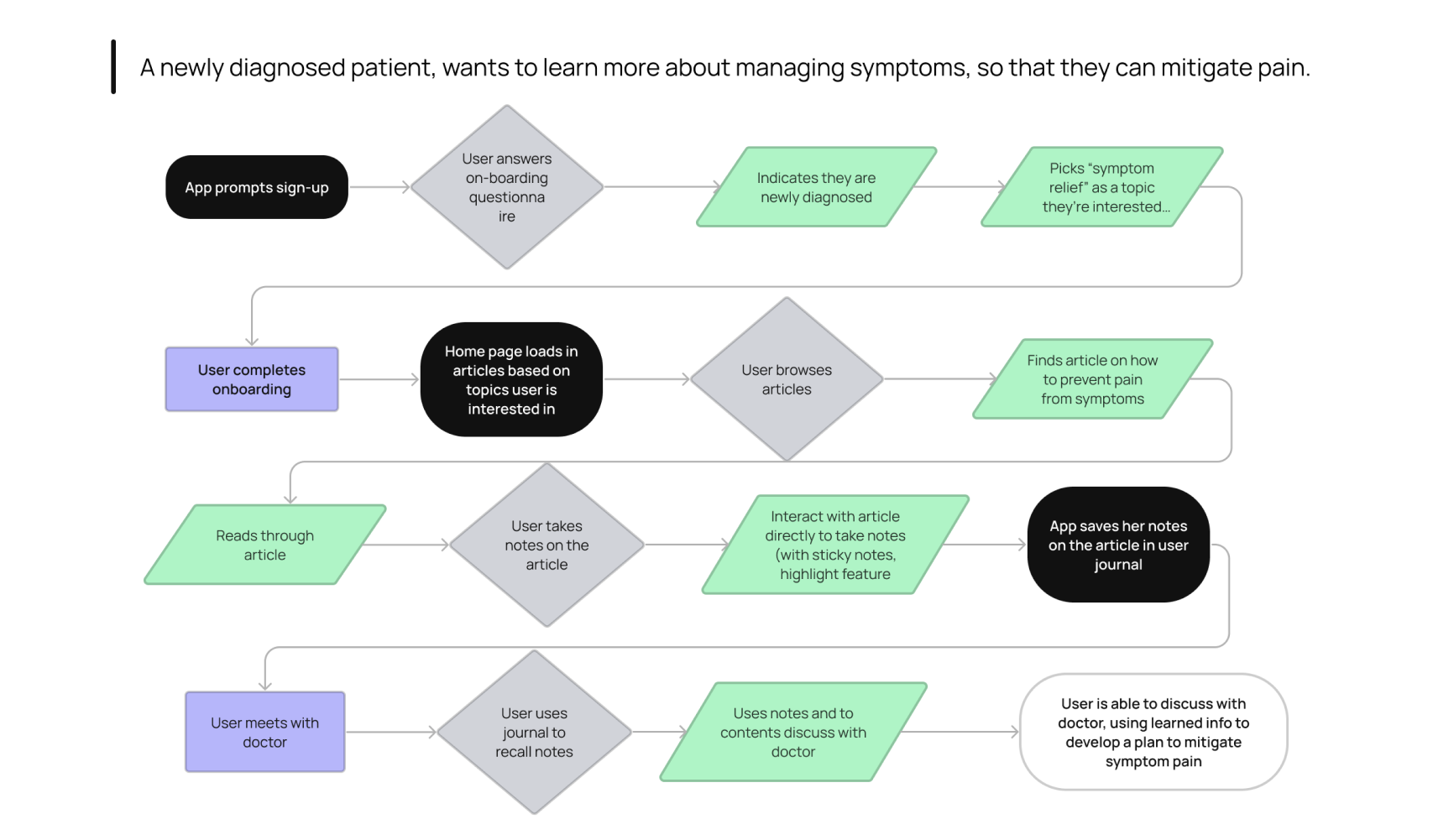
We created user flow maps to understand how users would interact with the proposed features and utilize them in their goals of receiving better care.
Building off of our persona for Kim, the newly diagnosed patient, this particular flow represents how the new Mission: Cure can act as a powerful tool to support users as they learn more about their condition, save their notes, and recall key points when they discuss next steps with their doctors.
Coordinating with Stakeholders & Developers
Our generative research provided insight into necessary features that would address user needs such as easy access to medical information, support managing their condition, and resources to better advocate for their care.
Synthesizing the findings, our team created a diagram of the envisioned user flow and app functionalities. We affinity-mapped it with stakeholders and the developer team to determine what could be implemented and prioritized within the project scope & resources.
Iterations
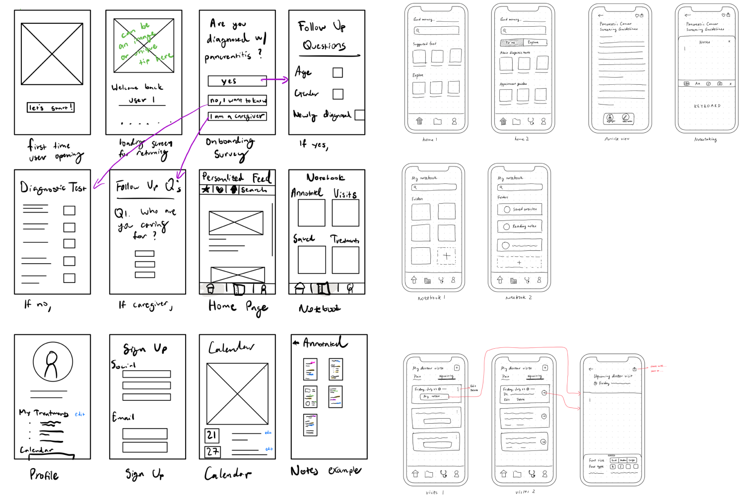
Sketches
Wireframes


Early Prototypes


Testing + Improvements
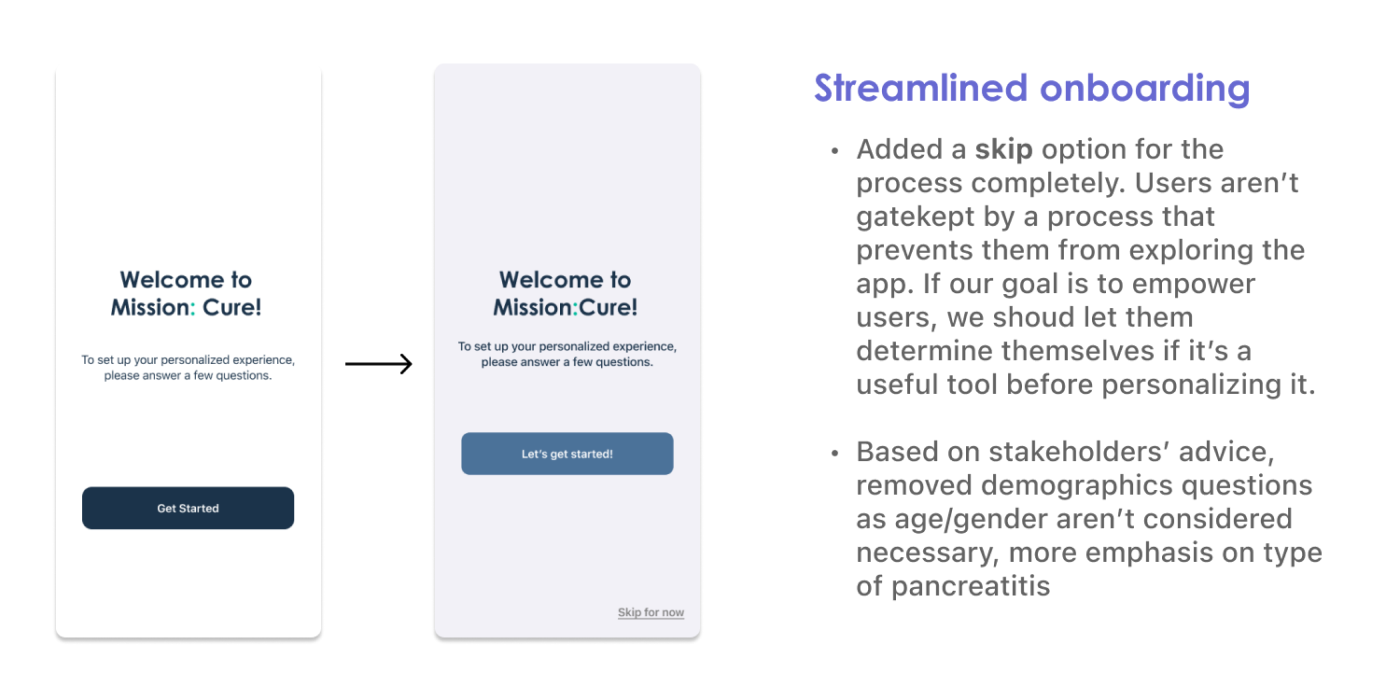
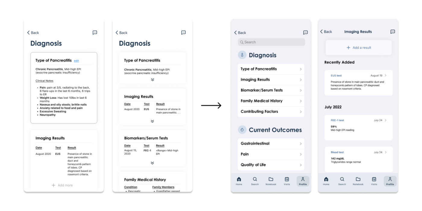
Based on user and stakeholder feedback from usability testing, our team progressively iterated and implemented 3 major updates to improve the prototypes.

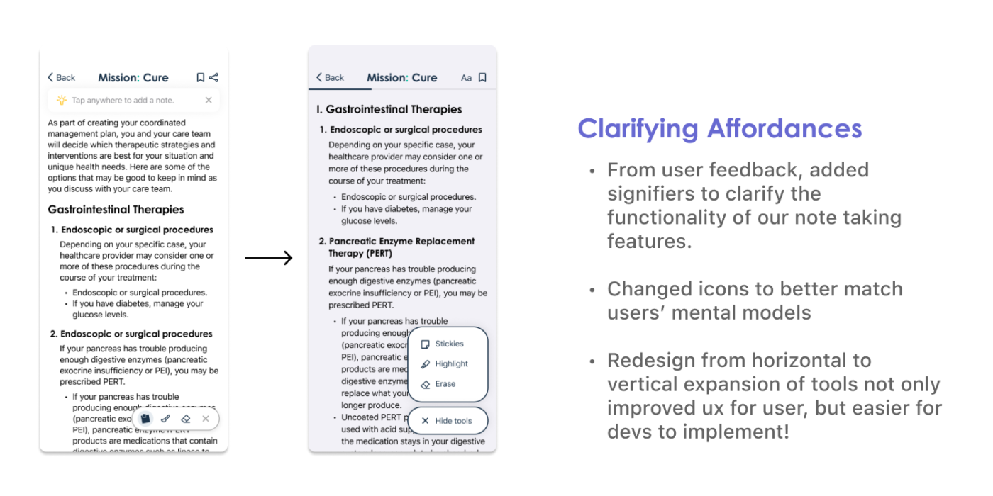
High Fidelity Prototypes
Onboarding


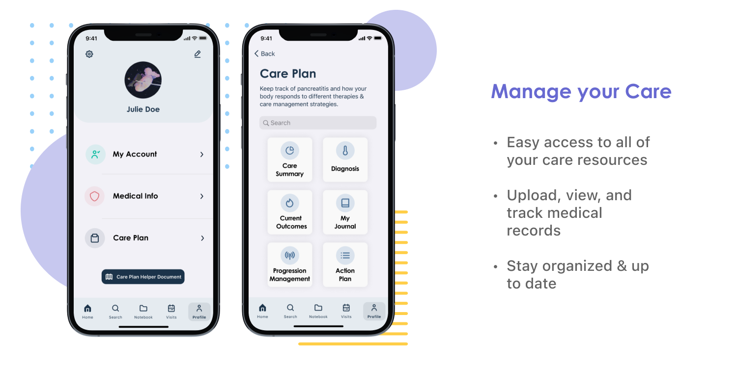
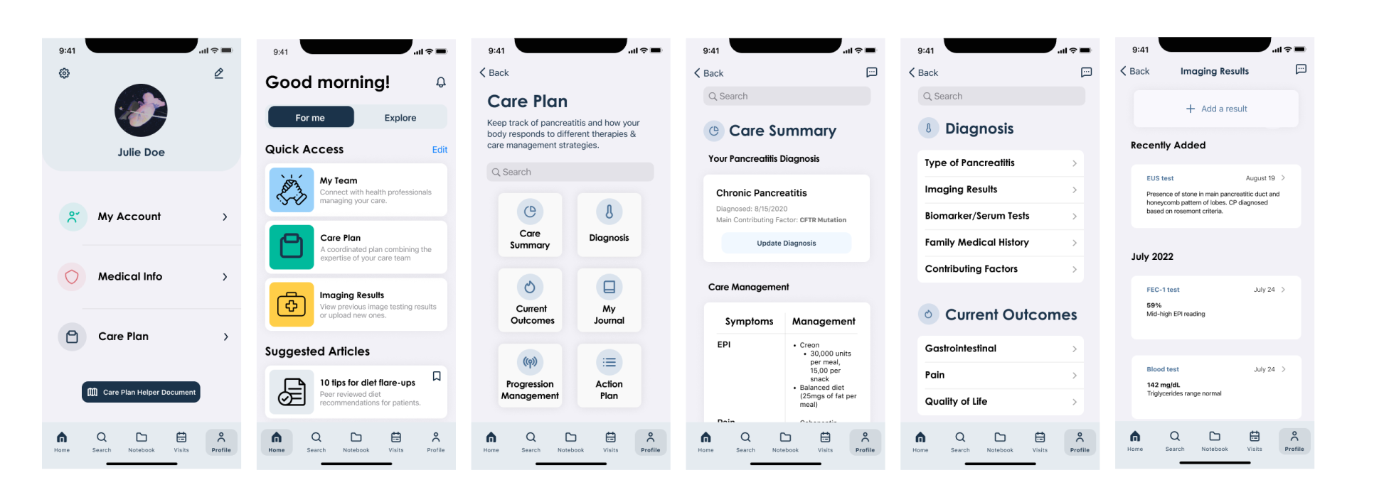
Care Plan
Articles Interaction

Next Steps
This project is still under development. For our team’s next steps, we are focusing on:
For any further questions regarding my experience, please feel free to contact me